Recent Features and Improvements in GA4
Improvements for large scale data are part of the latest announcements of new features and functionality for Google Analytics latest release of GA4. These new improvements include a more expanded use of the data quality icon at the individual card level, a new “other” row message in the data quality icon, and new sampling controls for Analytics 360 properties including more detailed results and faster results.
What is the data quality icon?
The data quality icon allows you to quickly see if your data is based on 100% of the data available or if it is part of an aggregate data set derived from all the available data. You can find this icon on the upper right hand corner of any of the individual cards in a generated report. The icon will be either a green checkmark (unsampled report) or an orange triangle. (threshold applied)
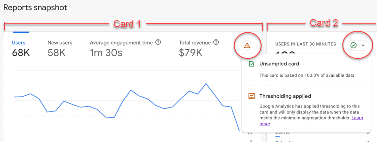
Unsampled Card – This card is based on 100% of available data. (See Card 2 in the image)
Threshold Applied – Google Analytics has applied thresholding to this card and will only display the data when the data meets the minimum aggregation thresholds. (See Card 1 in the image)
Thresholds can be applied for a couple of reasons in Google Analytics:
- Google Signals
- “Data in a report or exploration may be withheld when Google signals is enabled and you have a low user count in the specified date range.”
- Demographic Information
- “Data may be withheld and you may experience thresholding or incompatibility constraints when viewing a report or exploration or making an API call that includes demographic information in combination with user identifiers (e.g., user ID, client ID), custom dimensions, or certain user-generated content fields (e.g., source/medium).”
- Search Query Information
- “If a report or exploration includes search query information, the row containing that data may be withheld if there aren’t enough total users.”
Google typically applies thresholds in order to improve the speed at which reports are generated, or to prevent being able to infer a user’s identity based on interests, demographics or other signals.
Historically the data quality icon was available only at the top of the reporting snapshot report and the overview reports. This update now allows you to see this message and how it applies to each card in a given report.
The “(other)” Row
A source of continued frustration for many analytics practitioners are reports in which the “(other)” row appears. These rows appear when there is a high volume of unique data points that exceed cardinality limits. Google states that “cardinality refers to the number of unique values assigned to a dimension.” As an example imagine a report containing the page path dimension, if a single page path has a unique query parameter associated with it, like a session ID, that page path could have a high degree of cardinality.
- https://www.example.com/
- https://www.example.com/?session=j389ej
- https://www.example.com/?session=sdr56j
- https://www.example.com/?session=56uher
- https://www.example.com/?session=a45ged
- https://www.example.com/?session=jwerwe
In the above example you can see that a single URL can take on multiple variations even though it is generally the same page to each user. High-cardinality dimensions are dimensions with more than 500 unique values in one day and are subject to being placed in the (“other”) row of a report. There are a couple of ways to prevent this from happening, you could filter out unneeded query parameters, adjust the sample size (date range changes) or use the Explore feature. In this latest update Google states:
- All properties now have a one-click option to create the same report in Explore. The “(other)” row never appears in Explore because it uses raw, event-level data.
- If you are a Google 360 client: Google Analytics 360 properties also have access to expanded data sets, allowing you to flag up to 100 reports per property as high priority. Google Analytics permanently removes the “(other)” row from the reports you’ve flagged.
With the cutoff for switching from Universal to GA4 quickly approaching, it is good to see the continued improvements and feature rollouts. With a generally lackluster assessment of GA4 by the community I hope to see many more of these updates to help address users’ concerns.